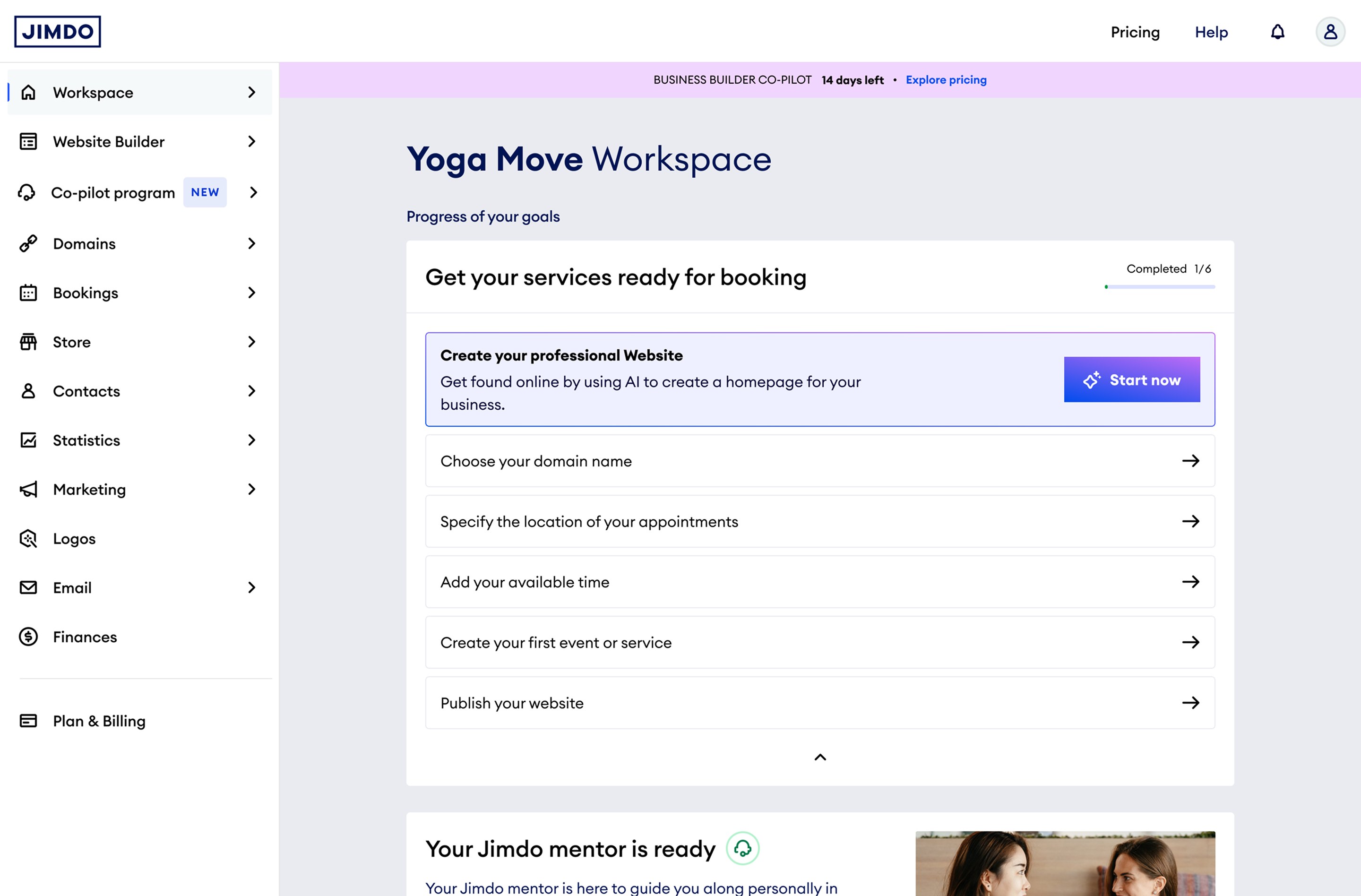
Jimdo already gave founders a website builder, an online store, bookings, and more. What was missing wasn't another tool. It was something that told each founder which one to open first. The Business Workspace became that layer, a personal view built around one founder's goals, not a shared list of everything the product could do.
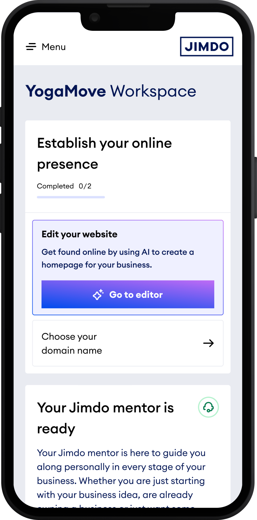
Most founders open Jimdo from their phone before they ever sit down at a laptop. Every screen in this project was designed mobile-first, then scaled up for desktop, not the other way round.
Product prototype, Business Workspace
A website builder, an online store, bookings, marketing, invoicing: most of what a founder needed already existed somewhere in Jimdo. The problem wasn't missing features. It was that every product asked the founder to already know what she wanted, before she'd figured out what her business needed first.
"I sell jewellery to friends already. I just need someone or something to tell me what to do next."
"I've quit my job to chase this. I know what I want to build, but I'm paralysed by the sheer number of decisions."
This didn't start as a dashboard redesign. It started with a simpler question: who is actually using this, and where are they in their business? Working with user research and the product data we already had, we grouped founders into a few clear stages, someone with just an idea, someone mid-setup, someone already running a live business, and traced what each of them actually needed to do next. That exercise is the reason the to-do list works the way it does today. It doesn't hand every founder the same list. It asks where they are first, then builds from there.
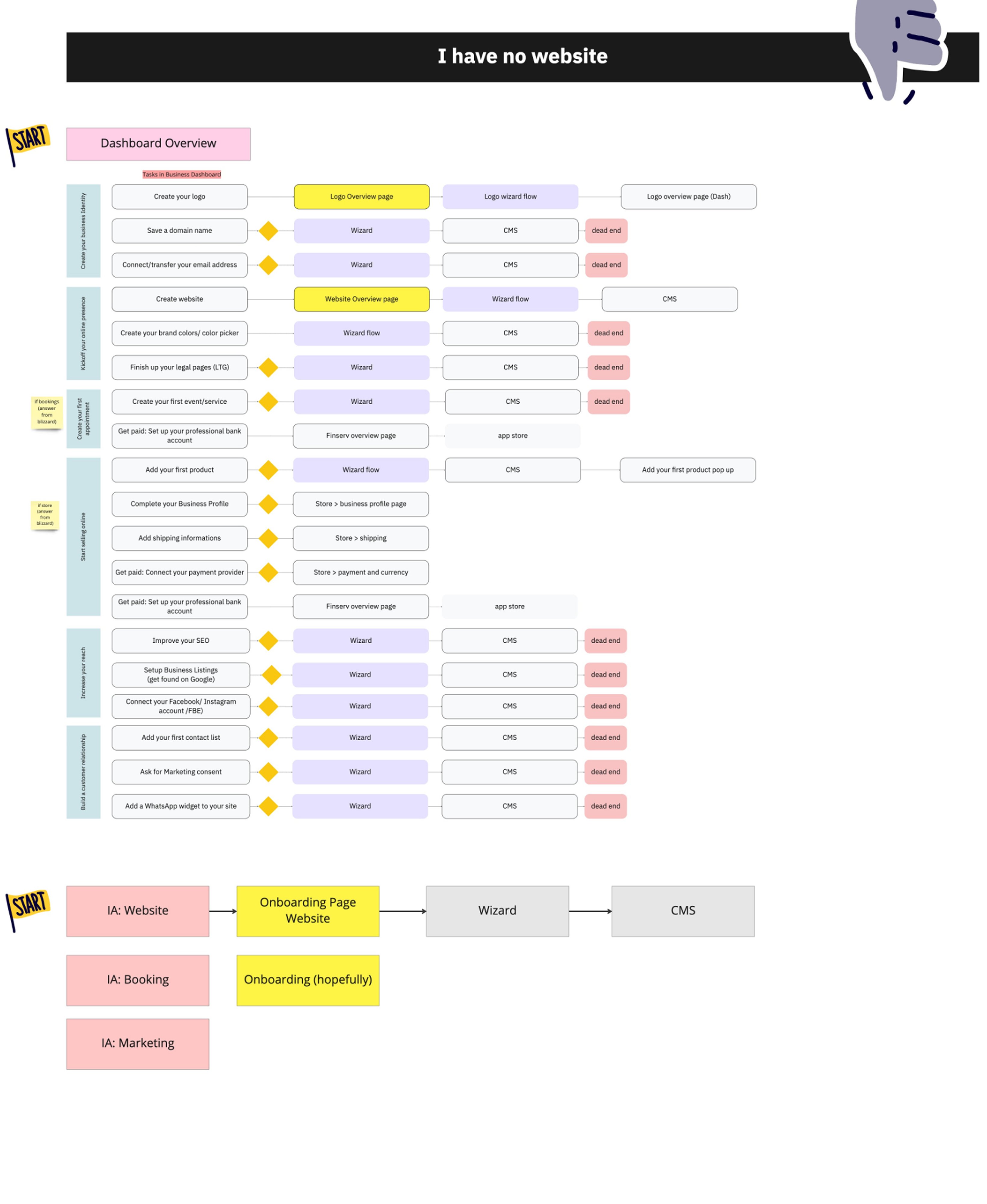
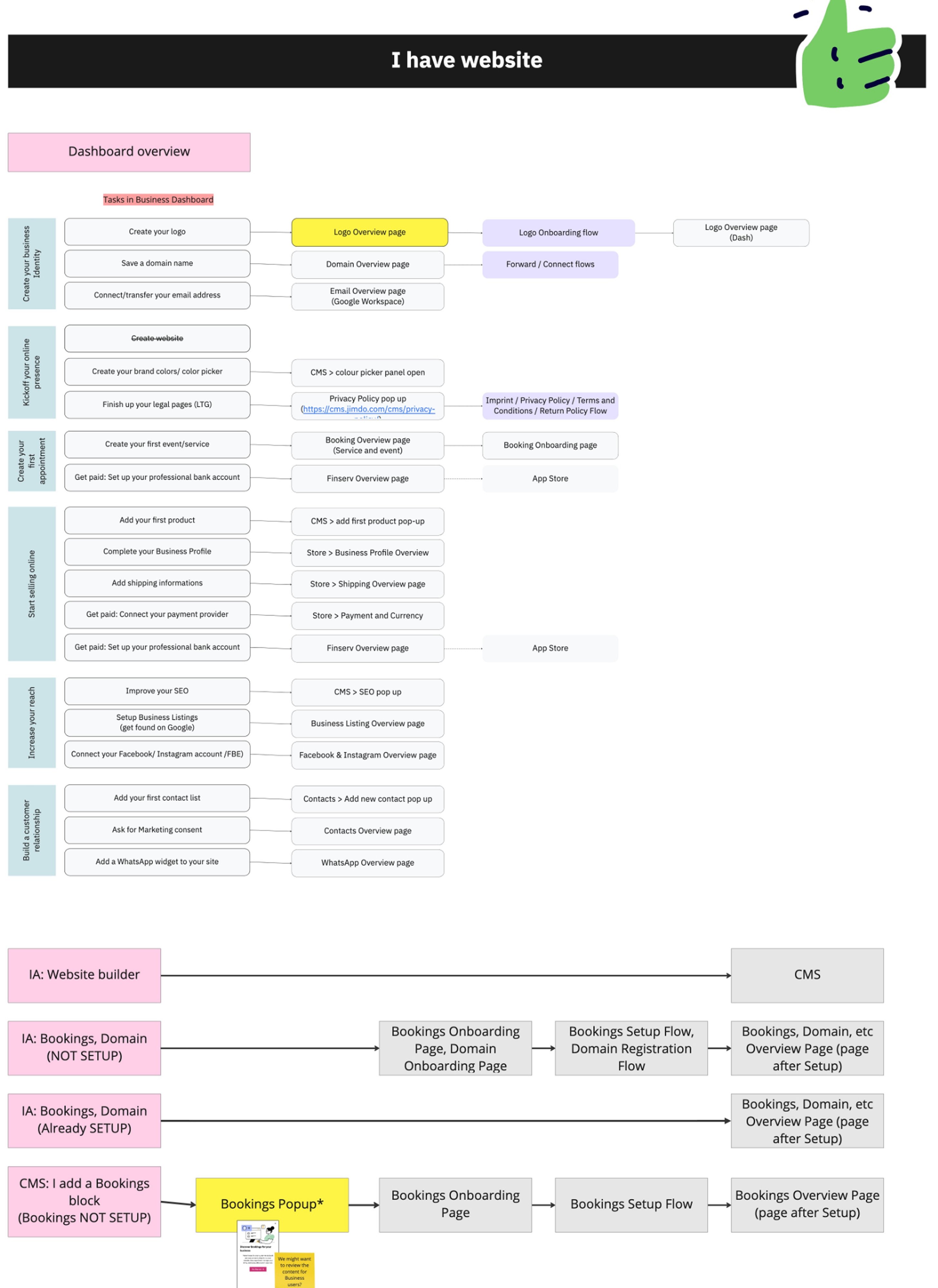
We walked through the dashboard as a founder who hadn't published a site yet, task by task. Wizards assumed a live site already existed. Links pointed to pages that weren't there. Marking every one of those dead ends on this board is what proved the problem wasn't the dashboard itself. It only worked for founders further along than we'd assumed.
We ran the identical exercise for a founder who already had a live site. Same task list, same dashboard, but now every step led somewhere real. Putting the two boards side by side made the fix obvious: stop assuming one starting point, and let the dashboard know which founder it's actually talking to.
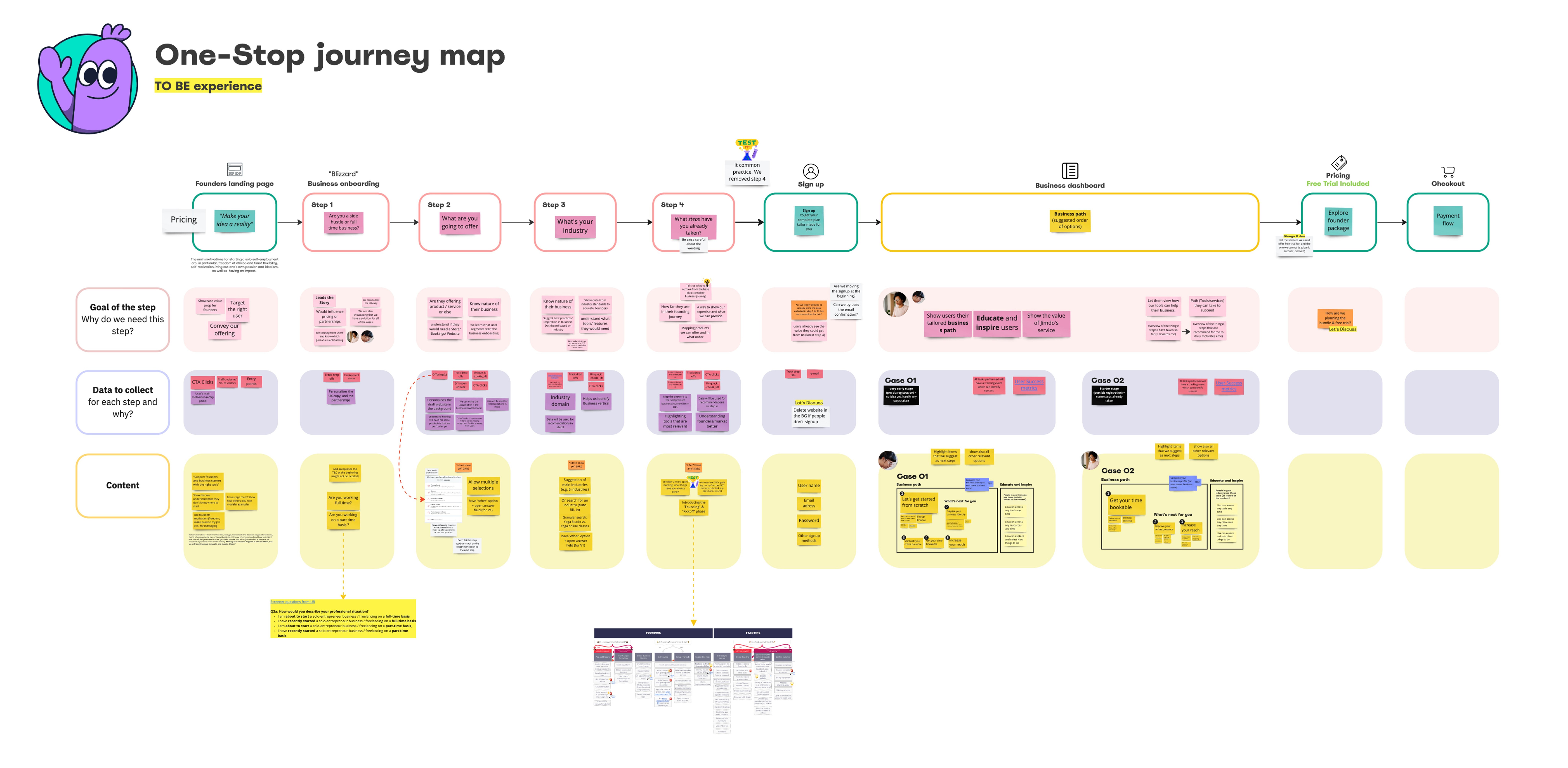
Zooming out from the dashboard, this maps the full path a founder takes: landing page, the onboarding questions, sign-up, their personalised business path, pricing, and checkout. It's the blueprint the whole workspace experience got built against, and it's still what I check new features against today.
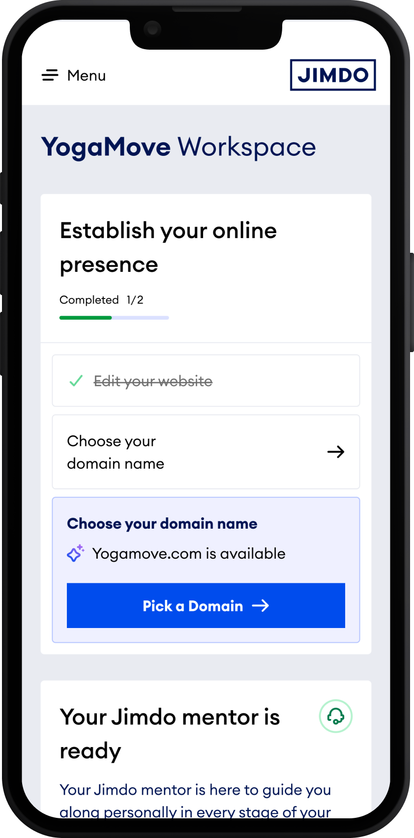
That's still the logic behind the to-do list today: work out where someone is, then show the next task for that stage, not every task at once.
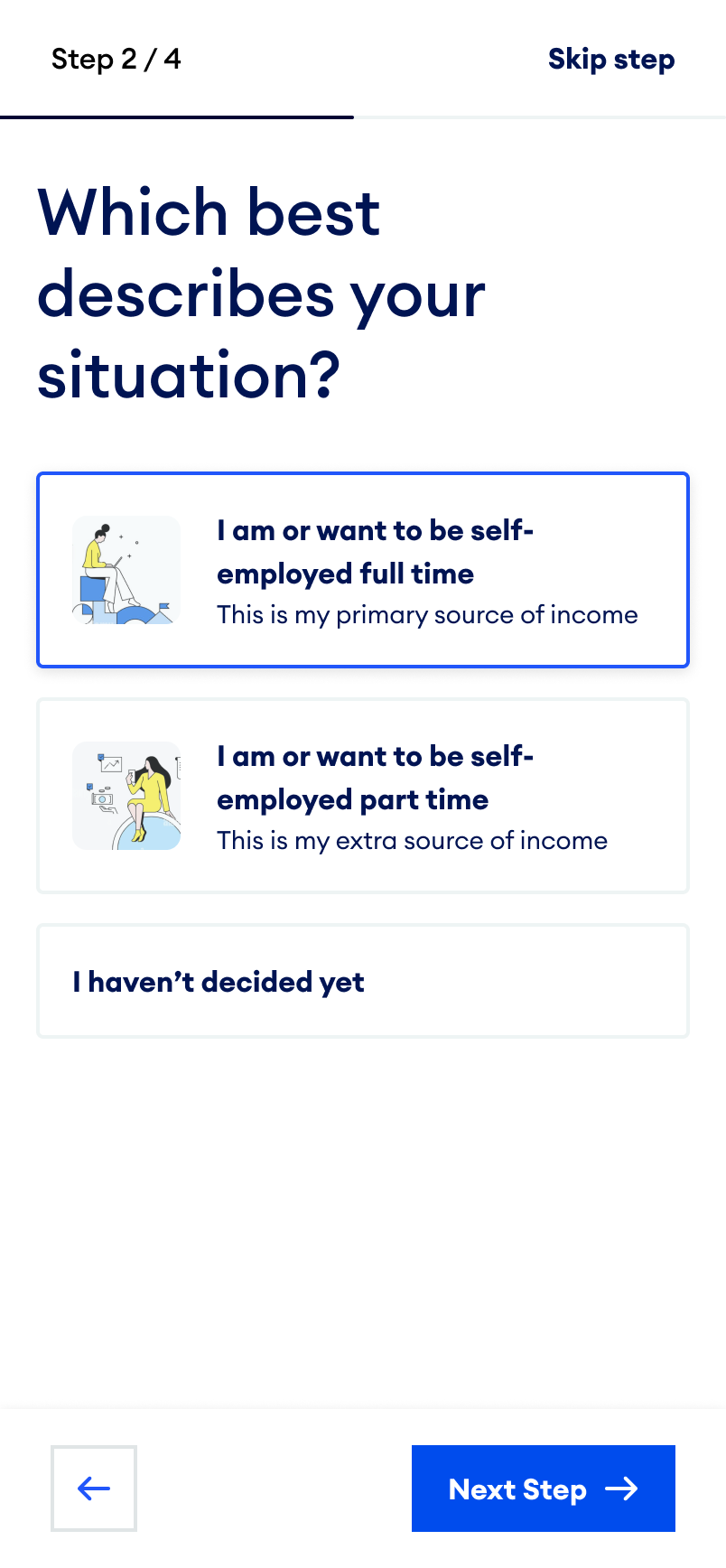
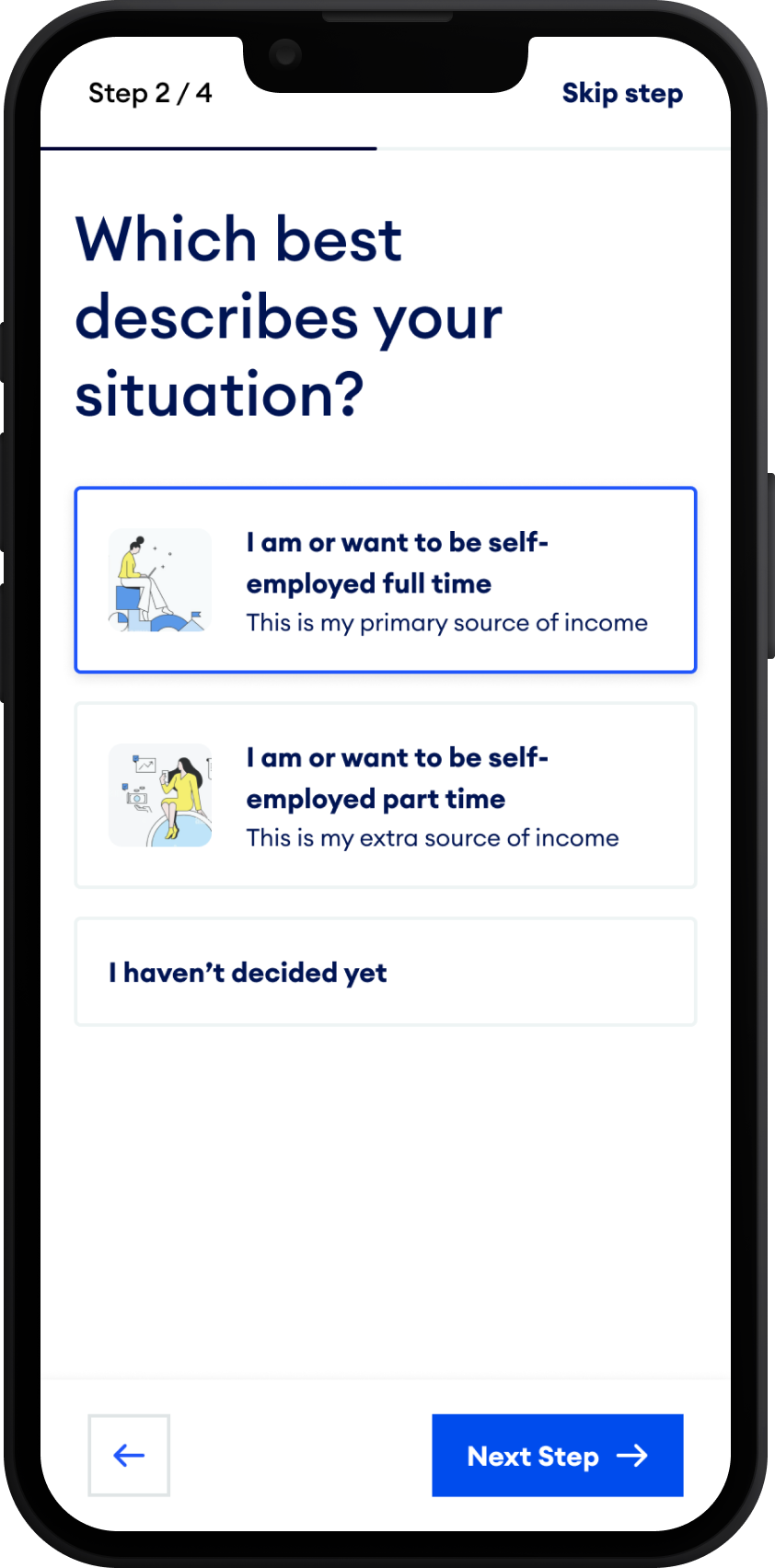
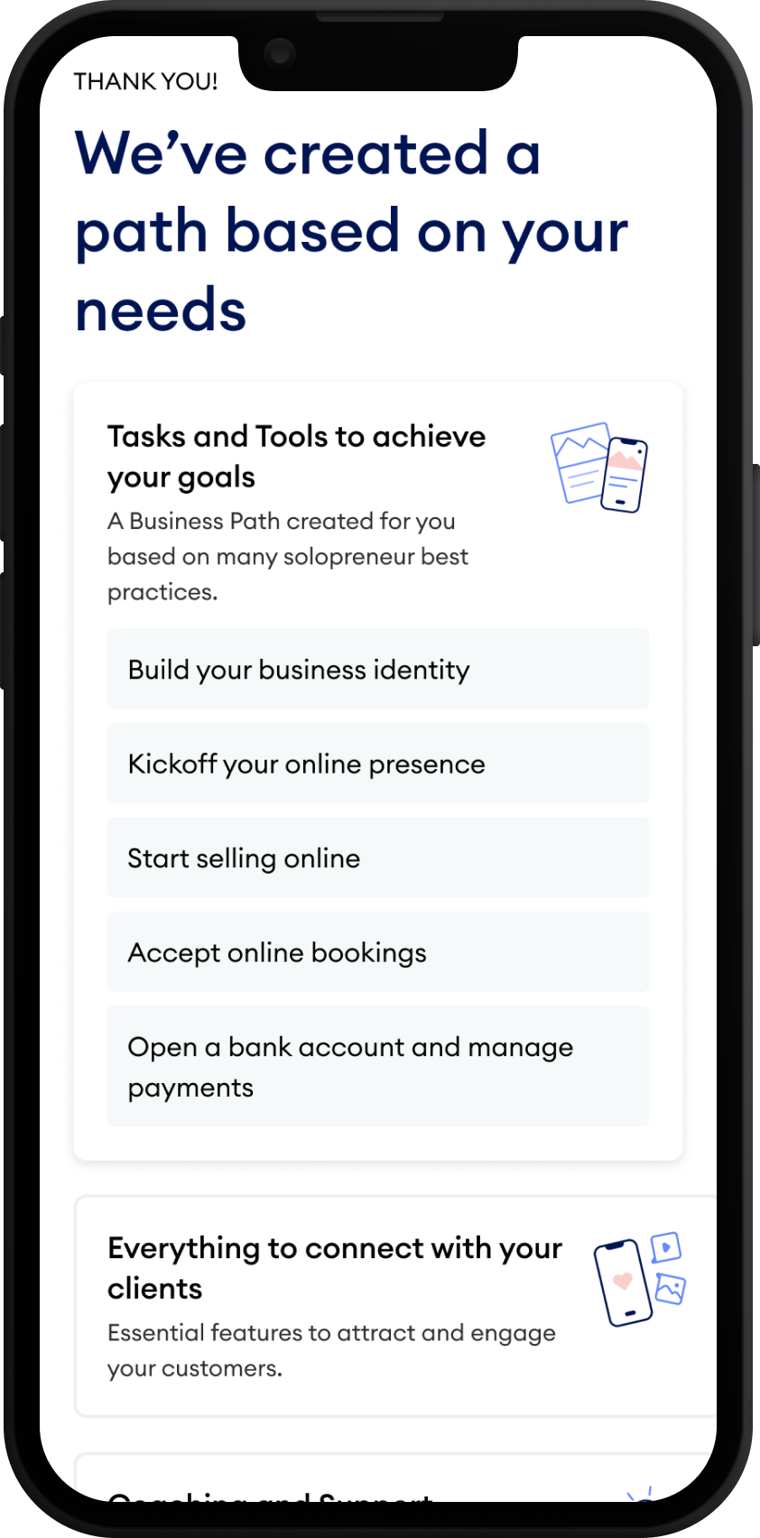
This wasn't a discarded concept. It's the onboarding we designed and shipped first, a short, fixed-choice form: pick your work type, pick your situation, get a checklist. It ran for a while, before we had the confidence to hand a real conversation over to AI. It proved the idea, founders who finished it were more likely to take a next step. But the categories were rigid. A yoga teacher and a photographer could land on the same three tasks, because the form had no way to ask a follow-up question.
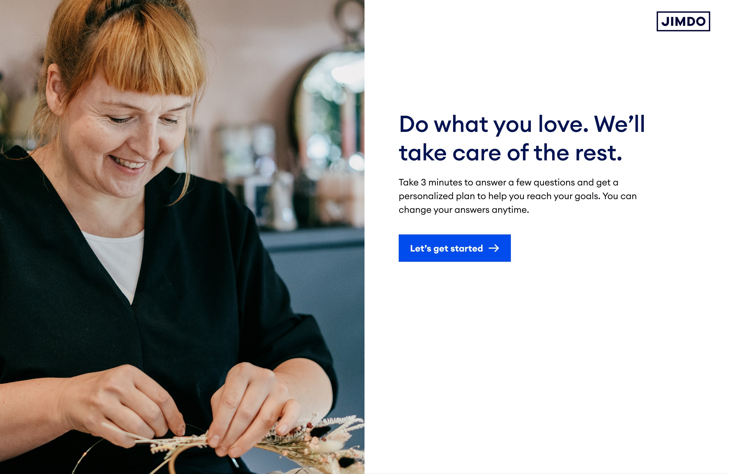
The entry point was a short questionnaire instead of a long sign-up form: three minutes, four steps, one plan at the end. Every answer came from a fixed list. It was useful for structure, but it couldn't capture what made each business different. Running it taught us two things worth keeping: founders were willing to answer a few questions if it meant less guesswork, and fixed categories weren't enough to describe a real business every time. That second point is what eventually pushed the next version toward open conversation.
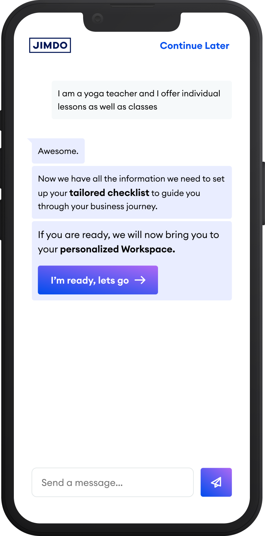
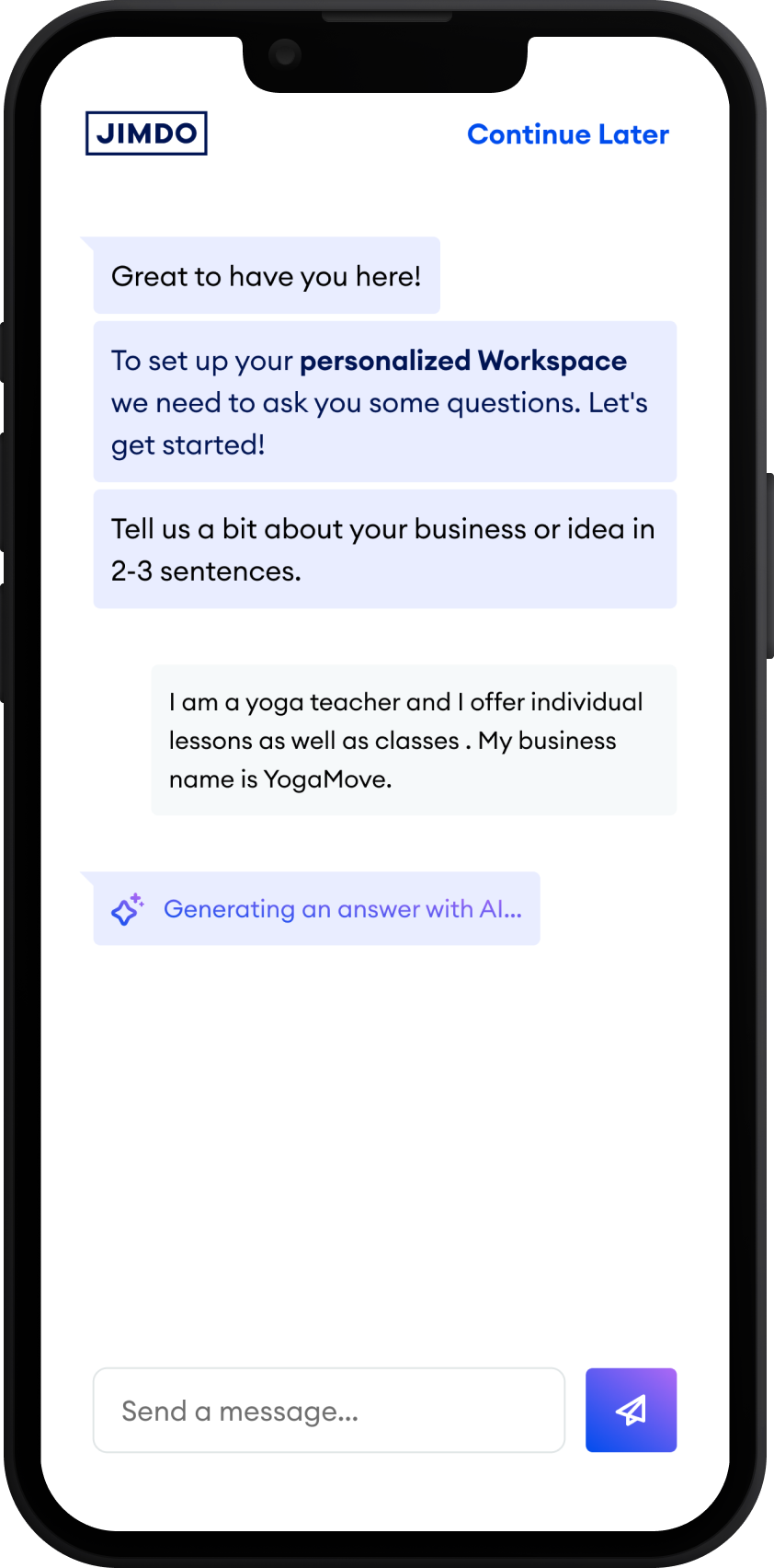
This isn't a setup wizard, and it isn't the final product either. It's the foundation everything after it stands on. A founder describes her business in her own words, and that description is what makes the workspace feel personal from the very first screen.
Onboarding hands off to the workspace, and the workspace keeps going. It reorders itself around what the founder is trying to do next, surfaces one task instead of a feature list, and adjusts as the business changes: a website goes live, a first booking comes in, a new goal gets set.
The first version we shipped got the job done, but asked the founder to translate herself into fixed categories. The version that replaced it flipped that: describe your business in your own words, and let the system do the translating.
Pick from a fixed list, get a generic path: the same handful of tasks for every business tagged "wellness."
Describe it in her own words, get a workspace built around that description: different tasks, different order, for every business.
The results came from three compounding experiments: AI Onboarding, Domain Recommendations, and Personalised Next Steps. It wasn't one single lever. It was the system working together.
The metric we cared most about was 2D7: whether a user set up at least two products within seven days of signing up. It was our strongest leading indicator for free-to-paid conversion. That rate roughly doubled.
Founders don't need more features explained to them. They need to know what to do next. That's a positioning problem before it's an interface problem.
Personalisation is only as good as what you learn at onboarding. Get that conversation wrong, and everything built on top of it is guessing.
AI is a delivery mechanism, not a strategy. The hard part was always deciding what to guide someone toward. AI just made that guidance easier to give.
Currently open to senior product design roles focused on AI, personalisation, and complex system design.
Get in touch →