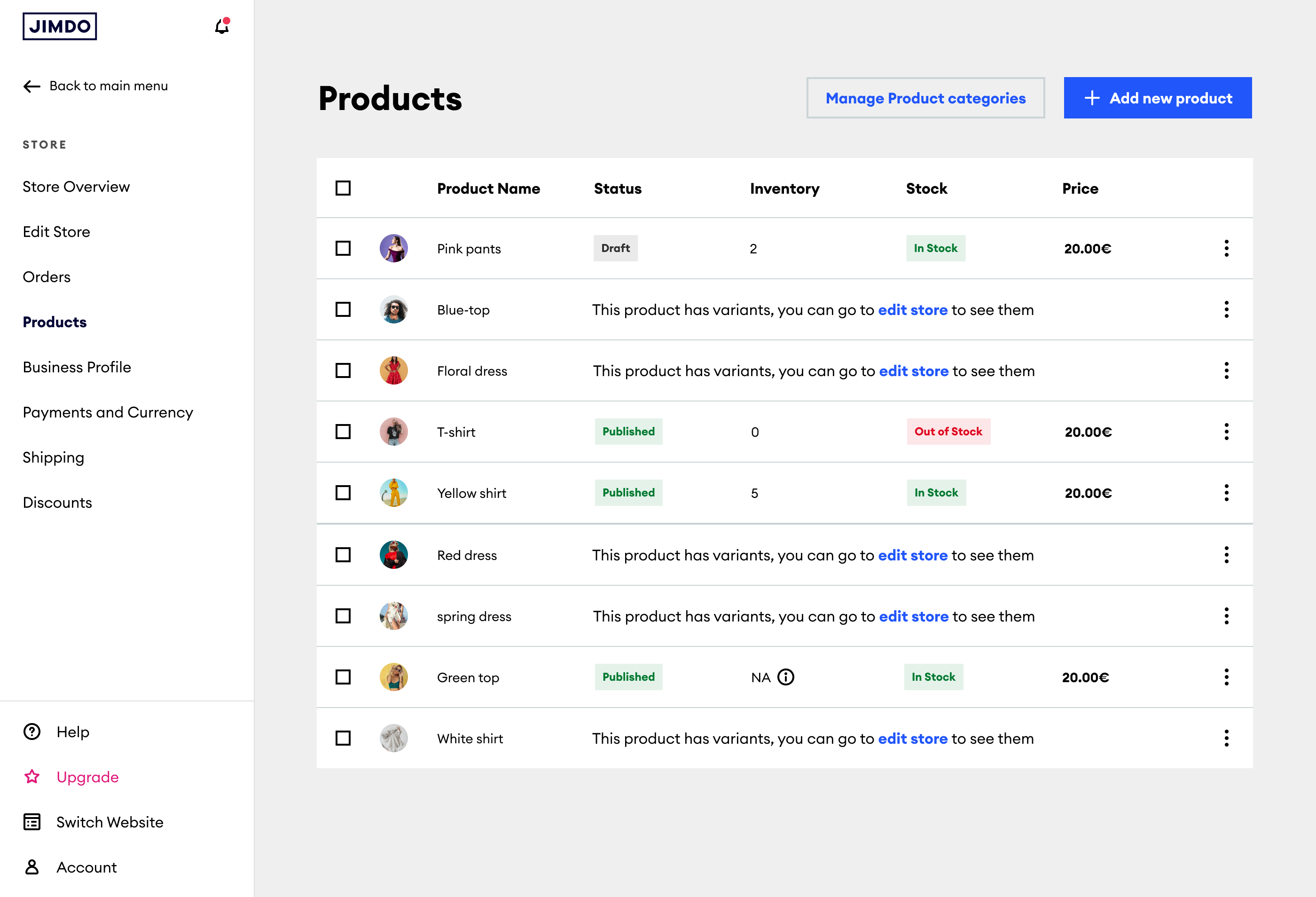
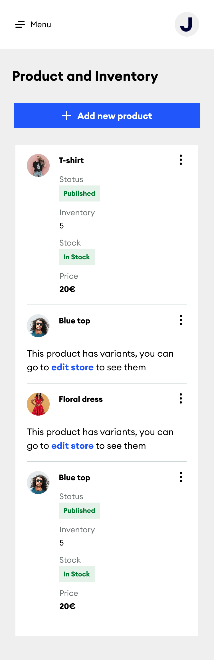
The product list on desktop, and on mobile
I redesigned how store owners manage products, categories and stock, so it works properly on both desktop and mobile.
The product list on desktop, and on mobile
Product management lived inside a single panel in the website editor. That worked fine for a few products, but not for a real catalogue. As sellers added more, the panel got harder to use, especially on mobile. It wasn't a visual design problem. Product management needed its own structure, outside the website editor.

The old CMS flow: buried under "Products and categories," tucked into a side panel, one product at a time.
We spoke with people running real stores online, at different stages of their business, but with the same problem: managing products got harder as their catalogue grew.
We focused on the first group: people who already had several products online and were starting to feel the limits of a simple list.
Editing a website and managing a product catalogue are different tasks. The old layout treated them as one.
A short list works fine. A real catalogue needs categories. Scrolling alone doesn't cut it.
Store owners often check stock or update products from their phone, away from their desk.
Store owners already use tools like Shopify. The system needed to feel familiar, not clever.
Instead of expanding the existing panel, we moved product management out of the website editor completely. It became its own section in the main navigation, with its own list and detail pages. That's a structural change, and it changes how the product can grow over time.
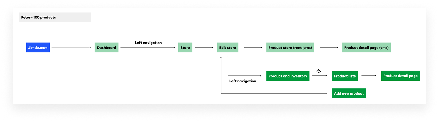
The actual flow we mapped out for Peter, a store with 100 products, from login through to the new Products section.
I held an early brainstorming and discovery workshop with the PM, EM and both engineers. We mapped out every action Peter needed to take, and walked through his journey step by step, before sketching a single screen. Grouping those ideas together is what shaped the new IA.
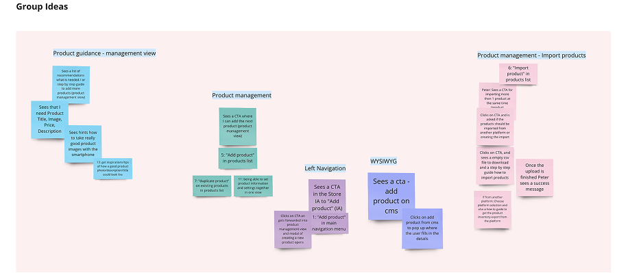
Group Ideas: clustering everything the team raised, from product guidance to importing products in bulk.
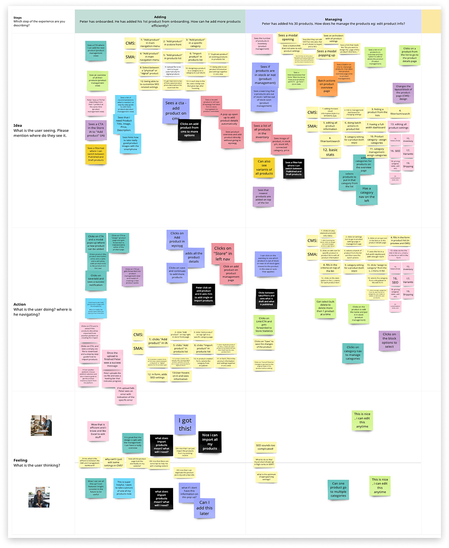
Peter's journey, mapped step by step: from adding his first products to managing a hundred of them.
A few decisions shaped the design, shown here in the real interface.
The list: status, category management and row actions, all at a glance.
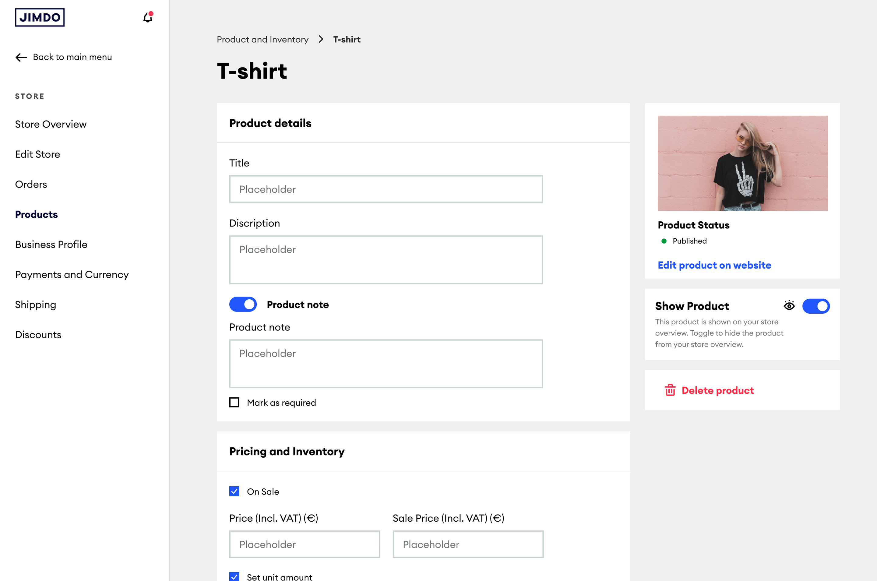
The detail page: its own screen, separate from the list.
Store owners often check stock or update a listing away from their desk. On mobile, they needed to be able to do everything they could on desktop.
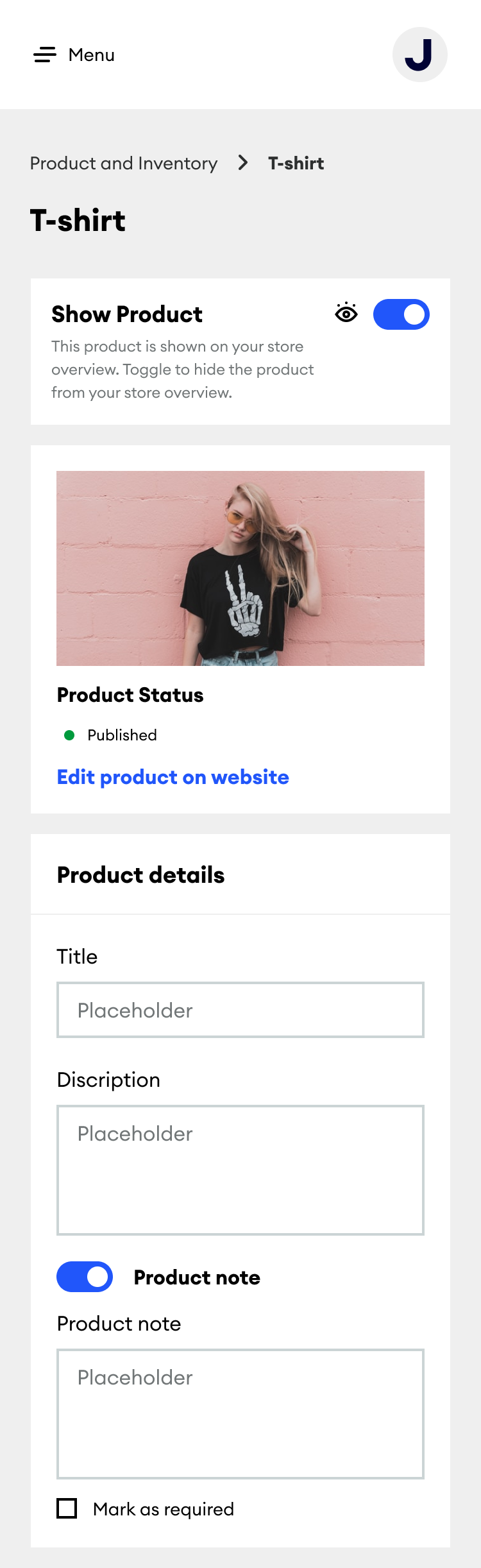
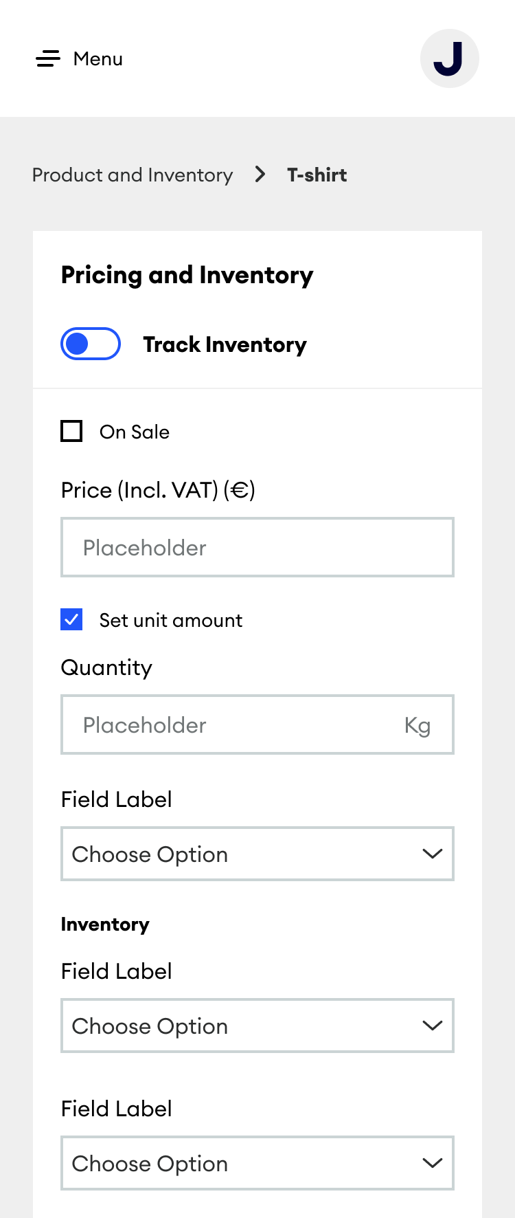
We tested the flow and the copy with real store owners, rather than only internal reviewers. Their feedback shaped some of the details in the design.
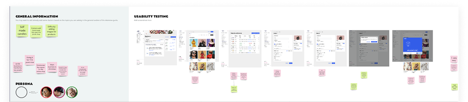
Notes from one of the usability testing sessions: participant background on the left, the screen-by-screen walkthrough on the right.
No usage metrics are available for this project.
Moving something into the main navigation is a real decision. It's not a cosmetic change. The team has to support and maintain it going forward.
Good tools for running a business shouldn't draw attention to themselves. They should just work, even as the number of products grows.
Decisions like this work better when engineers are involved from the start, rather than brought in at review. This one worked because the PM, EM and both engineers helped shape it early on.
Currently open to senior product design roles focused on practical, complex products.
Get in touch →